
 Strategy Tool
Strategy Tool
Strategy Tool
A skincare brand whose name means light. We built an identity where every detail catches the eye like sunlight on dewy skin — a brand confident enough to whisper.
Nira came to us with strong product science but no visual world. The skincare aisle is crowded with bright pinks, clinical whites, and copy that sells anxiety. We pulled hard in the opposite direction: the calmest brand on the shelf.
The name is Hebrew for light — or shining. So that became the brief: build an identity that glows quietly, the way real, healthy skin does. No screaming. No clinical sterility. Just a brand that says, "for skin that's already beautiful."
Skincare is a category that performs anxiety. We approached Nira as the opposite proposition — a brand for skin that's already beautiful.
Discovery sat with the science team — formulation notes, the meaning of the name, the kind of woman the founders kept describing. Strategy framed Nira as the post-clinical generation of skincare — botanical, gentle, grown-up. Creative work narrowed to one quiet device: removing the dot from the lowercase i and letting it fall as a drop. Every subsequent decision — palette, photography, packaging — was tested against a single brief: does this glow without shouting?
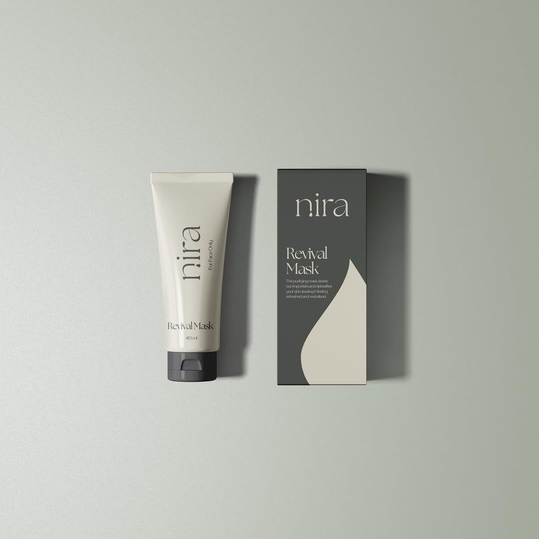
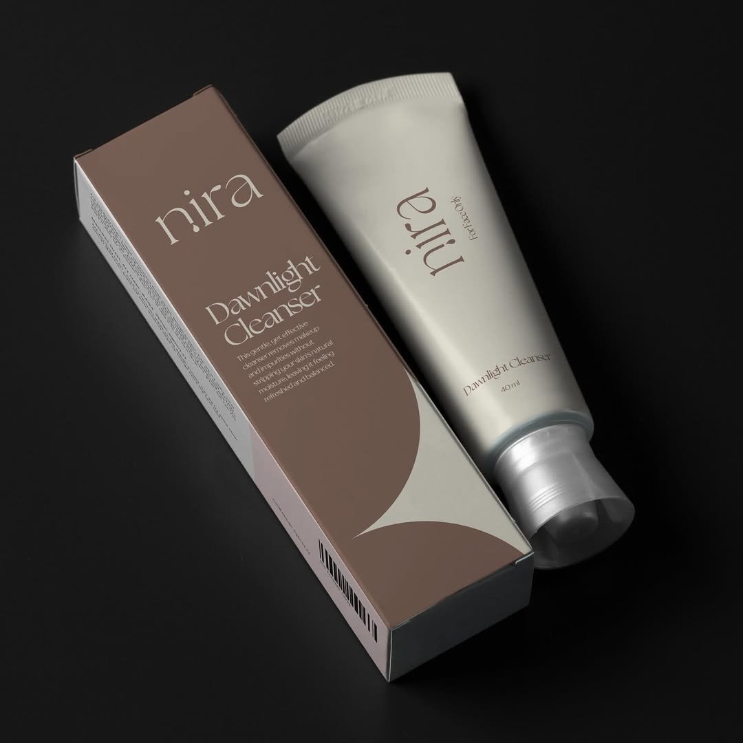
The wordmark hides the brand's secret. We removed the dot from the lowercase i — and let it fall.
A single drop of serum. A tear of dew. A moment of light made physical. It's the kind of detail you don't notice at first — and then can't unsee.
Two earthy primaries do the heavy work — a deep, grounded sage and a warm, lived-in mauve. Cream and bone keep the system airy. No clinical white, no neon, no compromises. The result feels grown-up and quietly feminine, like a brand that doesn't need to introduce itself.
Nira works the moment it touches the skin — and the system around it does the same. Editorial portraiture, plant-led texture, packaging you want to leave on the counter. The whole world feels like the brand promise made physical.


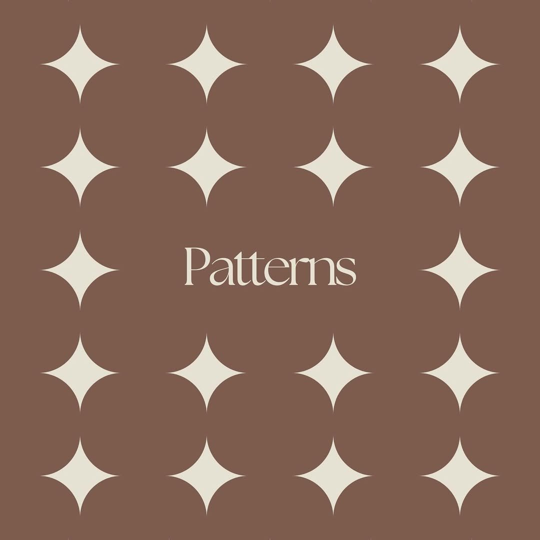
A four-pointed star — sharp, weightless, repeated. It reads as sunlight catching skin, or the glint a serum leaves behind.
Used quietly: as packaging texture, divider page, or a single mark sitting at the corner of a layout. Always in service of the product, never competing with it.
Nira launched with a fully composed world — identity, packaging, editorial and pattern system, all built to feel like one brand from day one.
The work covered the core identity and dotless-i mark, a four-pointed star pattern used as packaging texture and divider, full primary packaging across the cleanser, mask and serum lines — and a stationery suite carrying the same restraint. We directed the launch photography toward botanical texture and skin in soft daylight, then bound the system into a brand manual the team can hand to a printer, a photographer or a developer without rewriting the brief.
"The smallest mark on the page does the loudest work. A missing dot, a falling drop — that's the brand."
— Identity Notes · Nira Brand Guidelines
Nira now sits where it always belonged — next to a few quiet, considered brands rather than the loudest shelf in the aisle. The mark carries the rest.
The new identity unlocks the kind of buyer who reads the dropper bottle before the marketing — someone who would have walked past the category entirely. The brand can now show up in considered retail, editorial features and partner curations without changing tone for each room. It also gives the founders space to extend the range — body, hair, ritual — under one composed system, rather than relaunching each time.
— Continue reading
For other hospitality owners exploring brand work, our full approach to brand building for resorts and hotels covers our working approach in detail.