
 Strategy Tool
Strategy Tool
Strategy Tool
A luxury gold jewellery house built around iconic Indian motifs — twin peacocks, a lotus crown, deep forest velvet and antique gold. Heritage artistry, executed with modern restraint.
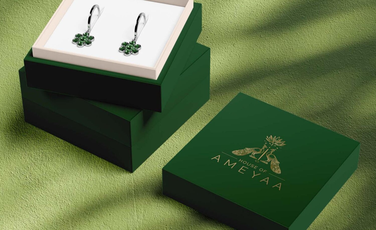
Ameyaa wanted an identity that could sit on a velvet bust, a wedding invitation and a marble showroom wall — all without losing its composure. A house mark, not a logo. A crest, not a label.
We drew the monogram by hand: two facing peacocks under a lotus crown, framed by clean symmetrical lines that nod to traditional Indian temple architecture. Set in antique gold against a deep forest green, it reads as inheritance — something the family already owned, and we simply uncovered.
We treated Ameyaa less like a logo project and more like a small act of archaeology — unearthing a house mark that already felt inherited.
Discovery began in the family's reference cabinet — temple brass, old wedding invitations, the geometry of a Rajasthani jharokha. From there we built a tight strategic frame: heritage without nostalgia, luxury without loudness. Creative exploration narrowed to a single hand-drawn system — twin peacocks, lotus crown, symmetrical rule lines — tested across a velvet bust, a foiled invitation and a marble showroom wall before a single specimen was signed off. Every decision pointed back to one question — does it still hold its composure?
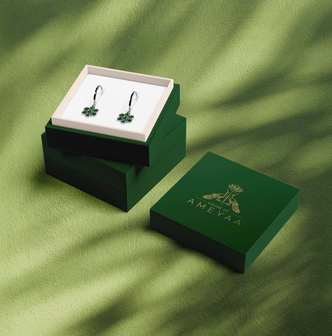
Three notes — a deep forest green that feels like temple velvet, a softer moss for breathing room, and antique gold reserved for the monogram itself.
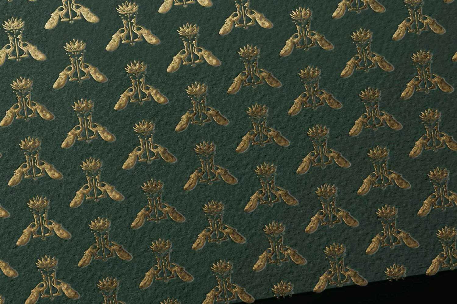
Owned pattern · Used on lining, packaging interiors, and invitations
The brief asked for a house mark that could travel. We delivered a full identity system built to live across showroom, ceremony and screen.
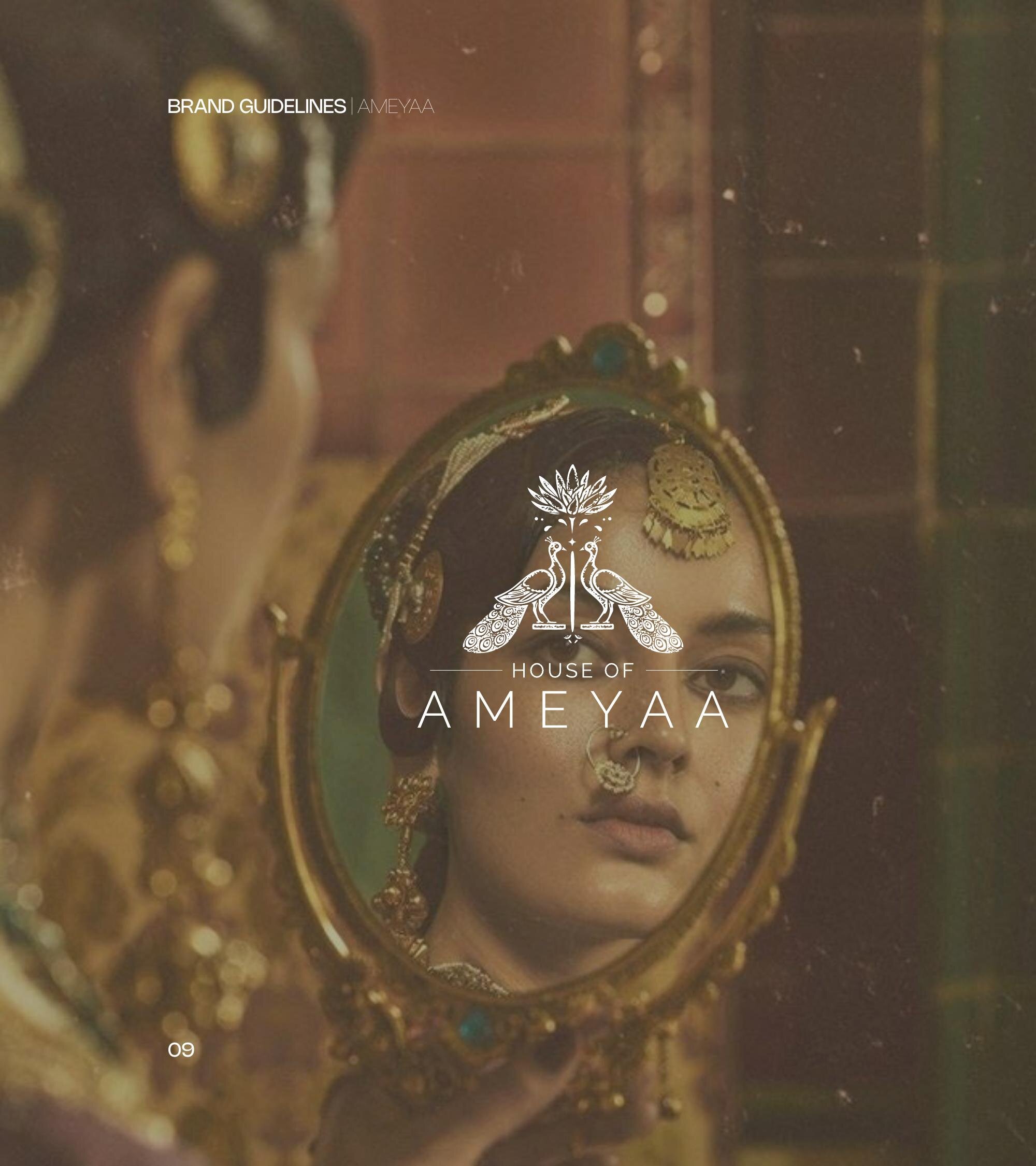
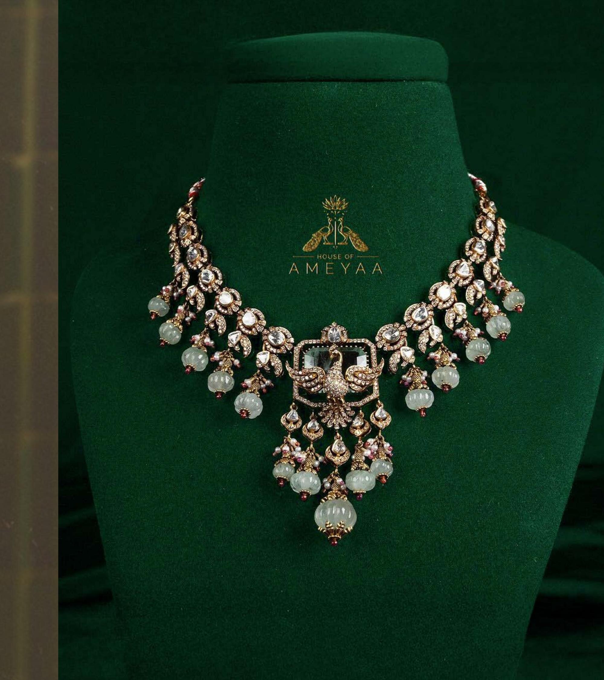
The work covered the core identity and hand-drawn monogram, an owned repeat pattern for linings and invitation interiors, packaging across earring boxes, presentation trunks and shopping bags — and a stationery suite for a house that still sends letters. We art-directed the first editorial photography too — bridal portraiture against antique gold mirrors, jewellery laid on forest velvet — so the brand world arrived fully composed rather than assembled later.

"Inspired by iconic Indian motifs — twin peacocks for harmony, a lotus crown for heritage, and sleek typography for modern balance — together forming a refined, timeless identity."
— Concept Note · House of Ameyaa Brand Kit
Ameyaa now reads as a house, not a label. The crest carries the weight — letting the jewellery, the room and the ceremony do the rest of the talking.
The new identity gives the family room to operate at the top of the gold jewellery market — a buyer who reads the mark before reading the price tag. Showroom signage, wedding-season campaigns and bespoke commissions all sit under one composed system. The brand can speak to a quieter, more discerning client now — and step into trunk shows and partnerships without having to introduce itself each time.
— Continue reading
For other jewellery houses thinking through brand identity, our extended approach to brand building for jewellery brands covers our working approach in detail.